
Component Canvas
Component Canvas
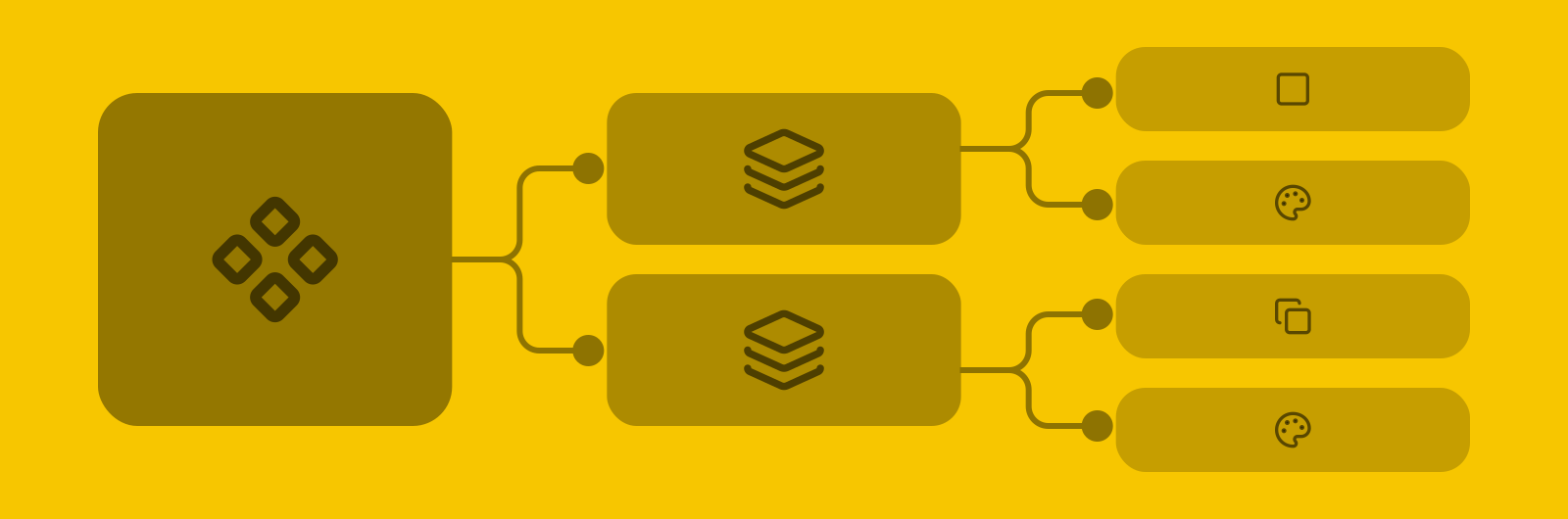
Visualize and plan design component relationships for design systems.
Visualize and plan design component relationships for design systems.
Project Type
experimental • tooling • passion project
Tags
exploration • design systems • design architecture
Roles
creator
Association
Creative Technologist
at
Pixel Uiz
in
2026
Motivations
With the rapid scaling of modern design systems and the growing complexity of component ecosystems, building a new design system or overhauling can be slow, tedious, or overwhelming. Fragmented documentation. Hidden component dependencies. Misalignment between design and engineering teams. This is why I built Component Canvas. The core idea is to help teams visualize pattern architecture from components down to tokens, drafting changes as easily as connecting nodes in a diagram. By keeping the interface stripped back and easy to understand, it encourages anyone on a product team to quickly and easily draft a complex relational plan regardless of how experienced they are in Figma or other tools. Lastly, the streamlined visual mapping ensures all stakeholders can easily understand and review the proposed system architecture.
Motivations
With the rapid scaling of modern design systems and the growing complexity of component ecosystems, building a new design system or overhauling can be slow, tedious, or overwhelming. Fragmented documentation. Hidden component dependencies. Misalignment between design and engineering teams. This is why I built Component Canvas. The core idea is to help teams visualize pattern architecture from components down to tokens, drafting changes as easily as connecting nodes in a diagram. By keeping the interface stripped back and easy to understand, it encourages anyone on a product team to quickly and easily draft a complex relational plan regardless of how experienced they are in Figma or other tools. Lastly, the streamlined visual mapping ensures all stakeholders can easily understand and review the proposed system architecture.
Motivations
With the rapid scaling of modern design systems and the growing complexity of component ecosystems, building a new design system or overhauling can be slow, tedious, or overwhelming. Fragmented documentation. Hidden component dependencies. Misalignment between design and engineering teams. This is why I built Component Canvas. The core idea is to help teams visualize pattern architecture from components down to tokens, drafting changes as easily as connecting nodes in a diagram. By keeping the interface stripped back and easy to understand, it encourages anyone on a product team to quickly and easily draft a complex relational plan regardless of how experienced they are in Figma or other tools. Lastly, the streamlined visual mapping ensures all stakeholders can easily understand and review the proposed system architecture.
Diagramming in Figma & FigJam
I used to plan large design system changes in Figma. I've also tried FigJam. Figma has the advantages of custom component designs for fine control over visuals and AutoLayout to keep things organized automatically. But it's not made for diagramming like FigJam, which provides connector lines that snap to nodes and stay connected as they move. While you can use Figma components inside FigJam, they're extremely limited and don't allow setting properties. And without any way of automatically organizing a diagram, they quickly get messy and difficult to update while building large or complex diagrams.
With a lot of tinkering, I did successfully build out a complex AutoLayout structure with flexible frames in Figma. And that helped me heavily iterate on a horizontal tree diagram of a design system, covering typography, spacing, colors, etc for each component in the system. It worked. But the time and effort it took to create just the right structure was steep. And it likely wouldn't apply to just any system or a variety of other structures if we needed to take a different approach. A lot of time went into a likely 1-off exercise. This is where I decide to try a different approach.
Diagramming in Figma & FigJam
I used to plan large design system changes in Figma. I've also tried FigJam. Figma has the advantages of custom component designs for fine control over visuals and AutoLayout to keep things organized automatically. But it's not made for diagramming like FigJam, which provides connector lines that snap to nodes and stay connected as they move. While you can use Figma components inside FigJam, they're extremely limited and don't allow setting properties. And without any way of automatically organizing a diagram, they quickly get messy and difficult to update while building large or complex diagrams.
With a lot of tinkering, I did successfully build out a complex AutoLayout structure with flexible frames in Figma. And that helped me heavily iterate on a horizontal tree diagram of a design system, covering typography, spacing, colors, etc for each component in the system. It worked. But the time and effort it took to create just the right structure was steep. And it likely wouldn't apply to just any system or a variety of other structures if we needed to take a different approach. A lot of time went into a likely 1-off exercise. This is where I decide to try a different approach.
Diagramming in Figma & FigJam
I used to plan large design system changes in Figma. I've also tried FigJam. Figma has the advantages of custom component designs for fine control over visuals and AutoLayout to keep things organized automatically. But it's not made for diagramming like FigJam, which provides connector lines that snap to nodes and stay connected as they move. While you can use Figma components inside FigJam, they're extremely limited and don't allow setting properties. And without any way of automatically organizing a diagram, they quickly get messy and difficult to update while building large or complex diagrams.
With a lot of tinkering, I did successfully build out a complex AutoLayout structure with flexible frames in Figma. And that helped me heavily iterate on a horizontal tree diagram of a design system, covering typography, spacing, colors, etc for each component in the system. It worked. But the time and effort it took to create just the right structure was steep. And it likely wouldn't apply to just any system or a variety of other structures if we needed to take a different approach. A lot of time went into a likely 1-off exercise. This is where I decide to try a different approach.
Imagining Component Canvas
With the advent of AI-assisted coding and rapid prototyping custom tools, I decided to experiment building a custom tool for this sort of task—one that could blend together what I wanted from both Figma and FigJam that neither could support while drastically simplifying the experience at the same time. It would still be canvas-based, built in a web framework, and would require a database and authentication.
I come across a tool called React Flow, which is essentially a customizable code component for building node-based diagrams. In particular, the layout options provide an array of different tree structures that can be created. I chose to use this as the base for the tool and build a custom UI around it. This choice also locked in React as the framework for this project.
Imagining Component Canvas
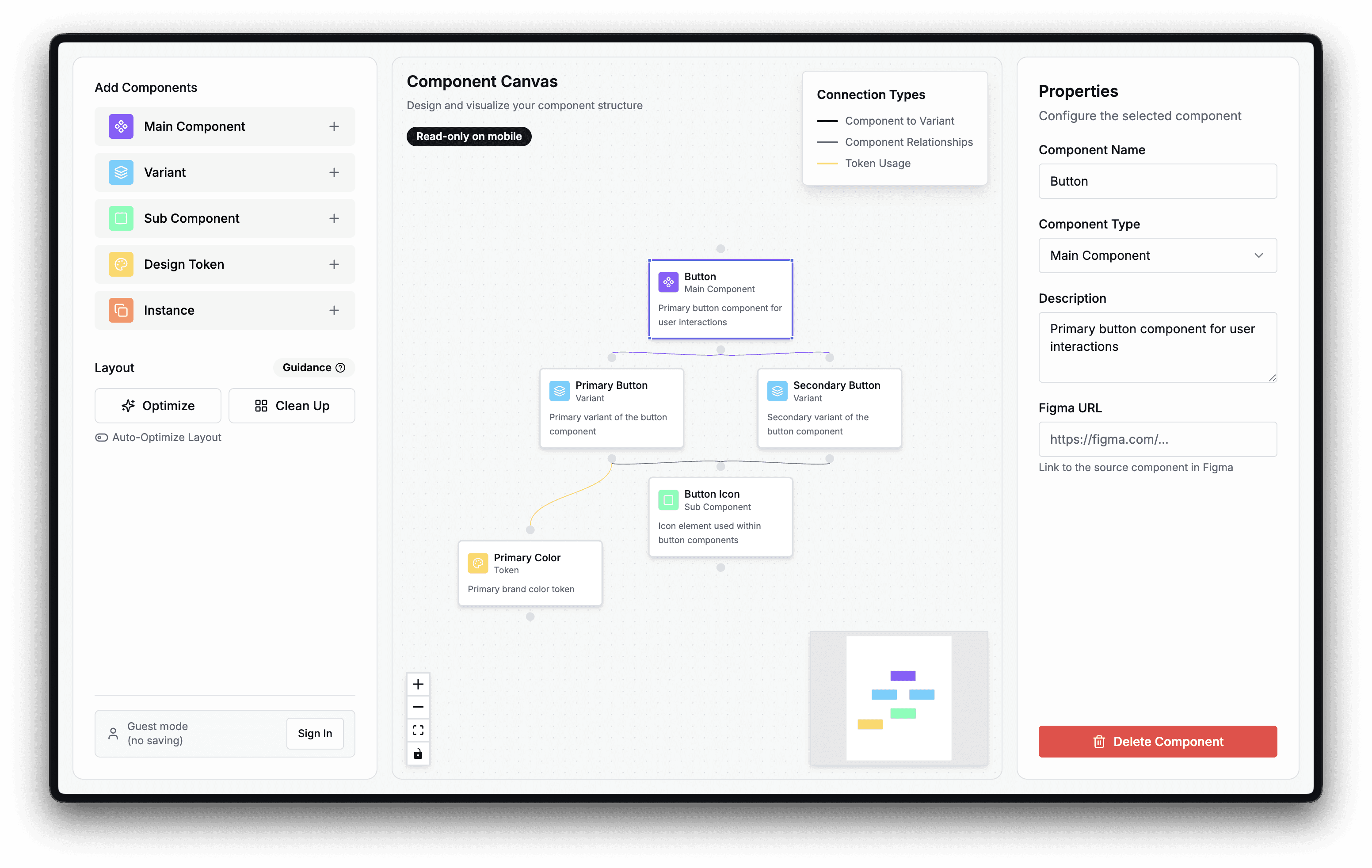
With the advent of AI-assisted coding and rapid prototyping custom tools, I decided to experiment building a custom tool for this sort of task—one that could blend together what I wanted from both Figma and FigJam that neither could support while drastically simplifying the experience at the same time. It would still be canvas-based, built in a web framework, and would require a database and authentication.
I come across a tool called React Flow, which is essentially a customizable code component for building node-based diagrams. In particular, the layout options provide an array of different tree structures that can be created. I chose to use this as the base for the tool and build a custom UI around it. This choice also locked in React as the framework for this project.
Imagining Component Canvas
With the advent of AI-assisted coding and rapid prototyping custom tools, I decided to experiment building a custom tool for this sort of task—one that could blend together what I wanted from both Figma and FigJam that neither could support while drastically simplifying the experience at the same time. It would still be canvas-based, built in a web framework, and would require a database and authentication.
I come across a tool called React Flow, which is essentially a customizable code component for building node-based diagrams. In particular, the layout options provide an array of different tree structures that can be created. I chose to use this as the base for the tool and build a custom UI around it. This choice also locked in React as the framework for this project.
Creating core features
Nodes
Once I spun up a React app with a canvas and React Flow ready to go, the next step was to define the node types I wanted available to diagram with. To align with how designers commonly create component libraries in Figma, the node types would be:
Main Component—represents top-level Figma components. Can be linked to Figma components.
Variant—represents Figma component variants
Sub-Component—represents nested Figma components
Design Token—represents design tokens / Figma variables. Types: color, spacing, corner radius, & size.
Instance—represents Figma component instances
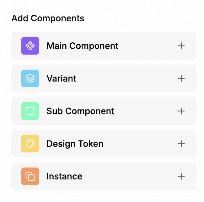
Each component type gets a name and description. If a Main Component node has an equivalent in Figma, it can be linked with the URL. Design Token nodes get an additional type field to specify whether it represents a color, spacing, corner radius, or size.
Layout Options
To solve one of the key pain points, I created 3 features that help clean up diagram structures:
Optimize / once: Applies an optimized layout. All nodes will be automatically placed for a clean structured tree-shaped layout.
Clean up / once: Applies slight adjustments to node positions to align them to the grid.
Auto-Optimize Layout / continuous: Applies layout optimizations continuously as changes are made.
This was the most difficult to get working. Though React Flow does have some options for structured tree diagrams, they each fall short one way or another. But with some trial and error, I eventually had these working as intended. Users can choose whether to apply layout optimization/clean-up on command or automatically as they go. Auto-Optimize Layout also auto-focuses on the current selected node and centers it within view. Either way, the results help keep a clean tree structure that avoids messy diagrams with crossed wires, overlapping nodes. Clean tree structures are much easier to read. But taking the work out of manually adjusting the layout makes the process effortless, increasingly beneficial the larger the structure.
Saving & Version History
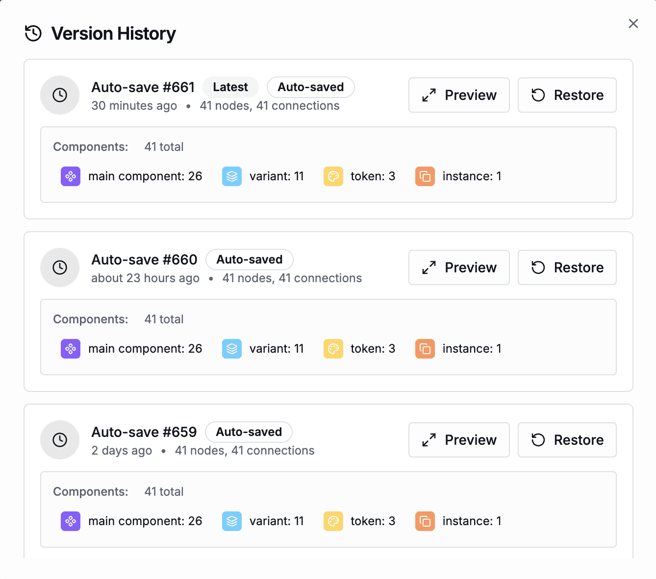
Users can choose whether Component Canvas auto-saves their work as they go or waits for manual saves. Additionally, each save is tracked in a version history log with the following details and features:
Details: Version index. Auto-saved vs manually saved. Relative time ago. Total node and connection count. Node count by type.
Preview: Opens a full-screen dialog with a read-only version.
Restore: Restores the selected version, added to the version history as a new entry.
Sharing
Users can choose to share their canvas with a public share link. Anyone with the link can view the canvas; no account needed. Share links can also be disabled at any time if the user choose to no longer allow public access to their canvas.
Color Theming
Component Canvas supports light, dark, and system color themes.
Mobile
On mobile devices, Component Canvas is limited to read-only mode. Core features like adding, removing, editing, or moving nodes and is designed and optimized for desktop only. I don't expect the intended audience for Component Canvas to need or want to edit visual diagrams on anything smaller than a tablet. So mobile support has neither been implemented nor planned.
Creating core features
Nodes
Once I spun up a React app with a canvas and React Flow ready to go, the next step was to define the node types I wanted available to diagram with. To align with how designers commonly create component libraries in Figma, the node types would be:
Main Component—represents top-level Figma components. Can be linked to Figma components.
Variant—represents Figma component variants
Sub-Component—represents nested Figma components
Design Token—represents design tokens / Figma variables. Types: color, spacing, corner radius, & size.
Instance—represents Figma component instances
Each component type gets a name and description. If a Main Component node has an equivalent in Figma, it can be linked with the URL. Design Token nodes get an additional type field to specify whether it represents a color, spacing, corner radius, or size.
Layout Options
To solve one of the key pain points, I created 3 features that help clean up diagram structures:
Optimize / once: Applies an optimized layout. All nodes will be automatically placed for a clean structured tree-shaped layout.
Clean up / once: Applies slight adjustments to node positions to align them to the grid.
Auto-Optimize Layout / continuous: Applies layout optimizations continuously as changes are made.
This was the most difficult to get working. Though React Flow does have some options for structured tree diagrams, they each fall short one way or another. But with some trial and error, I eventually had these working as intended. Users can choose whether to apply layout optimization/clean-up on command or automatically as they go. Auto-Optimize Layout also auto-focuses on the current selected node and centers it within view. Either way, the results help keep a clean tree structure that avoids messy diagrams with crossed wires, overlapping nodes. Clean tree structures are much easier to read. But taking the work out of manually adjusting the layout makes the process effortless, increasingly beneficial the larger the structure.
Saving & Version History
Users can choose whether Component Canvas auto-saves their work as they go or waits for manual saves. Additionally, each save is tracked in a version history log with the following details and features:
Details: Version index. Auto-saved vs manually saved. Relative time ago. Total node and connection count. Node count by type.
Preview: Opens a full-screen dialog with a read-only version.
Restore: Restores the selected version, added to the version history as a new entry.
Sharing
Users can choose to share their canvas with a public share link. Anyone with the link can view the canvas; no account needed. Share links can also be disabled at any time if the user choose to no longer allow public access to their canvas.
Color Theming
Component Canvas supports light, dark, and system color themes.
Mobile
On mobile devices, Component Canvas is limited to read-only mode. Core features like adding, removing, editing, or moving nodes and is designed and optimized for desktop only. I don't expect the intended audience for Component Canvas to need or want to edit visual diagrams on anything smaller than a tablet. So mobile support has neither been implemented nor planned.
Creating core features
Nodes
Once I spun up a React app with a canvas and React Flow ready to go, the next step was to define the node types I wanted available to diagram with. To align with how designers commonly create component libraries in Figma, the node types would be:
Main Component—represents top-level Figma components. Can be linked to Figma components.
Variant—represents Figma component variants
Sub-Component—represents nested Figma components
Design Token—represents design tokens / Figma variables. Types: color, spacing, corner radius, & size.
Instance—represents Figma component instances
Each component type gets a name and description. If a Main Component node has an equivalent in Figma, it can be linked with the URL. Design Token nodes get an additional type field to specify whether it represents a color, spacing, corner radius, or size.
Layout Options
To solve one of the key pain points, I created 3 features that help clean up diagram structures:
Optimize / once: Applies an optimized layout. All nodes will be automatically placed for a clean structured tree-shaped layout.
Clean up / once: Applies slight adjustments to node positions to align them to the grid.
Auto-Optimize Layout / continuous: Applies layout optimizations continuously as changes are made.
This was the most difficult to get working. Though React Flow does have some options for structured tree diagrams, they each fall short one way or another. But with some trial and error, I eventually had these working as intended. Users can choose whether to apply layout optimization/clean-up on command or automatically as they go. Auto-Optimize Layout also auto-focuses on the current selected node and centers it within view. Either way, the results help keep a clean tree structure that avoids messy diagrams with crossed wires, overlapping nodes. Clean tree structures are much easier to read. But taking the work out of manually adjusting the layout makes the process effortless, increasingly beneficial the larger the structure.
Saving & Version History
Users can choose whether Component Canvas auto-saves their work as they go or waits for manual saves. Additionally, each save is tracked in a version history log with the following details and features:
Details: Version index. Auto-saved vs manually saved. Relative time ago. Total node and connection count. Node count by type.
Preview: Opens a full-screen dialog with a read-only version.
Restore: Restores the selected version, added to the version history as a new entry.
Sharing
Users can choose to share their canvas with a public share link. Anyone with the link can view the canvas; no account needed. Share links can also be disabled at any time if the user choose to no longer allow public access to their canvas.
Color Theming
Component Canvas supports light, dark, and system color themes.
Mobile
On mobile devices, Component Canvas is limited to read-only mode. Core features like adding, removing, editing, or moving nodes and is designed and optimized for desktop only. I don't expect the intended audience for Component Canvas to need or want to edit visual diagrams on anything smaller than a tablet. So mobile support has neither been implemented nor planned.
Roadmap
While this project is experimental and public adoption is not a priority, I do plan to refine it and add features over time. Some of the potential updates include:
Support for multiple files. Currently, only 1 canvas can be managed at a time, per user.
Account management. Currently, users cannot change their email, password, or delete their account themselves.
Export to PDF. The option to share as a document may be a quick win that many product teams could benefit from.
Export to JSON or other file types. It may be worth exploring how product teams might want to digest these relationships in other forms to help with implementation beyond planning their design system architecture.
Roadmap
While this project is experimental and public adoption is not a priority, I do plan to refine it and add features over time. Some of the potential updates include:
Support for multiple files. Currently, only 1 canvas can be managed at a time, per user.
Account management. Currently, users cannot change their email, password, or delete their account themselves.
Export to PDF. The option to share as a document may be a quick win that many product teams could benefit from.
Export to JSON or other file types. It may be worth exploring how product teams might want to digest these relationships in other forms to help with implementation beyond planning their design system architecture.
Roadmap
While this project is experimental and public adoption is not a priority, I do plan to refine it and add features over time. Some of the potential updates include:
Support for multiple files. Currently, only 1 canvas can be managed at a time, per user.
Account management. Currently, users cannot change their email, password, or delete their account themselves.
Export to PDF. The option to share as a document may be a quick win that many product teams could benefit from.
Export to JSON or other file types. It may be worth exploring how product teams might want to digest these relationships in other forms to help with implementation beyond planning their design system architecture.
Conclusion
Component Canvas was a fun experiment I enjoyed building. It was one of my first React apps and first time working with React Flow. As a solo creative technologist, it's extremely valuable that so many resources and tools are easily accessible to the public. I look forward to building on this project in the future, potentially sharing it more broadly and offering it as a service.
Conclusion
Component Canvas was a fun experiment I enjoyed building. It was one of my first React apps and first time working with React Flow. As a solo creative technologist, it's extremely valuable that so many resources and tools are easily accessible to the public. I look forward to building on this project in the future, potentially sharing it more broadly and offering it as a service.
Conclusion
Component Canvas was a fun experiment I enjoyed building. It was one of my first React apps and first time working with React Flow. As a solo creative technologist, it's extremely valuable that so many resources and tools are easily accessible to the public. I look forward to building on this project in the future, potentially sharing it more broadly and offering it as a service.