

UI Kit / Component library
UI Kit / Component library
UI Kit / Component library
A component library and documentation site to address the lack of a source of truth for UI patterns and inconsistent implementation, resulting in improved efficiency, reduced friction in the design and development process, and long-term scalability.
A component library and documentation site to address the lack of a source of truth for UI patterns and inconsistent implementation, resulting in improved efficiency, reduced friction in the design and development process, and long-term scalability.
A component library and documentation site to address the lack of a source of truth for UI patterns and inconsistent implementation, resulting in improved efficiency, reduced friction in the design and development process, and long-term scalability.
Project Type
systems • tooling
Tags
scalability • efficiency • quality
Roles
Lead
Association
UI Designer
CallRail
in
2016
Background
This is where my role started when joining CallRail. When I joined, we were working with mostly Sketch files, along with a handful of older Photoshop files. Styling found across Sketch files was often inconsistent. Styling found in our code was also often inconsistent. And styling between our design files and code were also inconsistent. There was no source of truth. So I set out to establish one.
Process
Component library file (Sketch)
Implementation & testing
Style guide draft
Ongoing improvement
Documentation site
Shared library
Migration to Figma
Ongoing improvement
Process
Component library file (Sketch)
Implementation & testing
Style guide draft
Ongoing improvement
Documentation site
Shared library
Migration to Figma
Ongoing improvement
Process
Component library file (Sketch)
Implementation & testing
Style guide draft
Ongoing improvement
Documentation site
Shared library
Migration to Figma
Ongoing improvement
Audit
Before we could define what standards to put in place, components to build, or documentation to draft, we needed to audit the our existing UI to discover what patterns we had, what variations or inconsistencies could be consolidated, and where in the app these were typically located.
So we ran an audit. Because I was still pretty new to the team and our UX designer was more familiar with the product, she went page-by-page to log every UI pattern she could find, compiling her findings in a spreadsheet, which was quite large. She organized patterns into groups to get an overall sense of what types of UI elements we used and how they related to one another. Anticipating that we may be consolidating some patterns, she included which pages in the app where each pattern was found. Referencing that later would help provide context around what the pattern was used for as well as know how to locate it if we decided to make changes after the audit.
With the audit complete, I had a thorough reference guide for pretty much all the UI patterns that we currently had in the app. This work set me up well for tackling the next phase, creating our first component library.
Component library
The process
With a detailed list of all the UI patterns in the app, I could start building reusable components as symbols in Sketch, our UX design tool at the time. I essentially went through the audit one pattern at a time, visited a few locations where it existed in the app, and used the those coded instances to build out a standardized and reusable version in Sketch. I referenced the CSS through my browser’s inspect panel to ensure I had the most accurate colors for backgrounds, borders, and text, as well as pixel values for font sizes, border radii, heights, widths, and spacing. Every detail I could pull, I did.
As I built each new component, one common challenge was finding inconsistencies between instances of our coded UI patterns. So I had to take some creative license to make decisions on what the new standards would be moving forward. For example, we had slight variations in the border color and radius of form input fields. So I picked a color and kept pressing on.
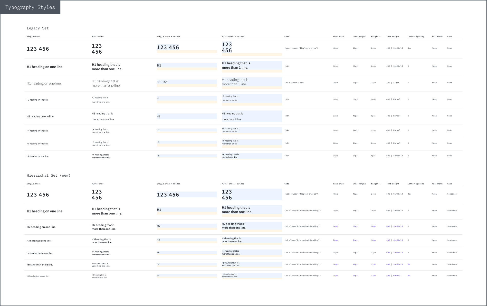
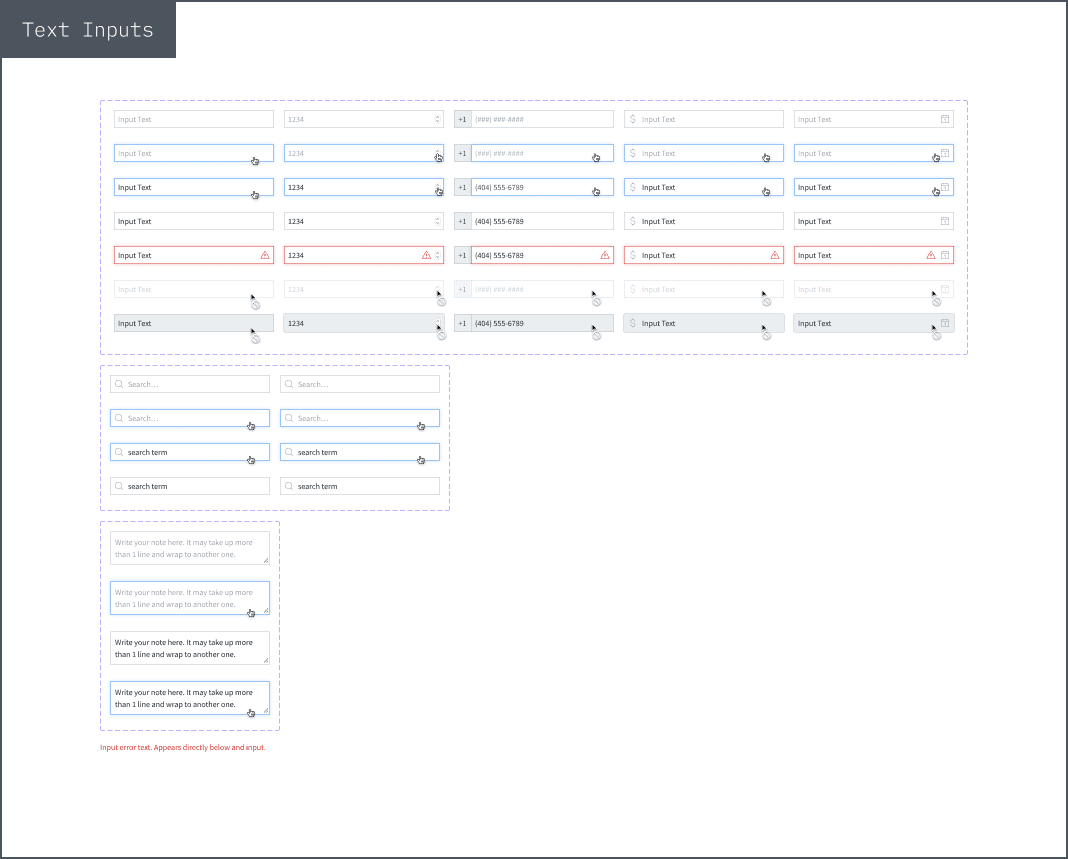
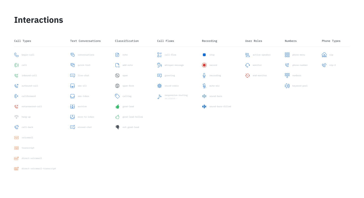
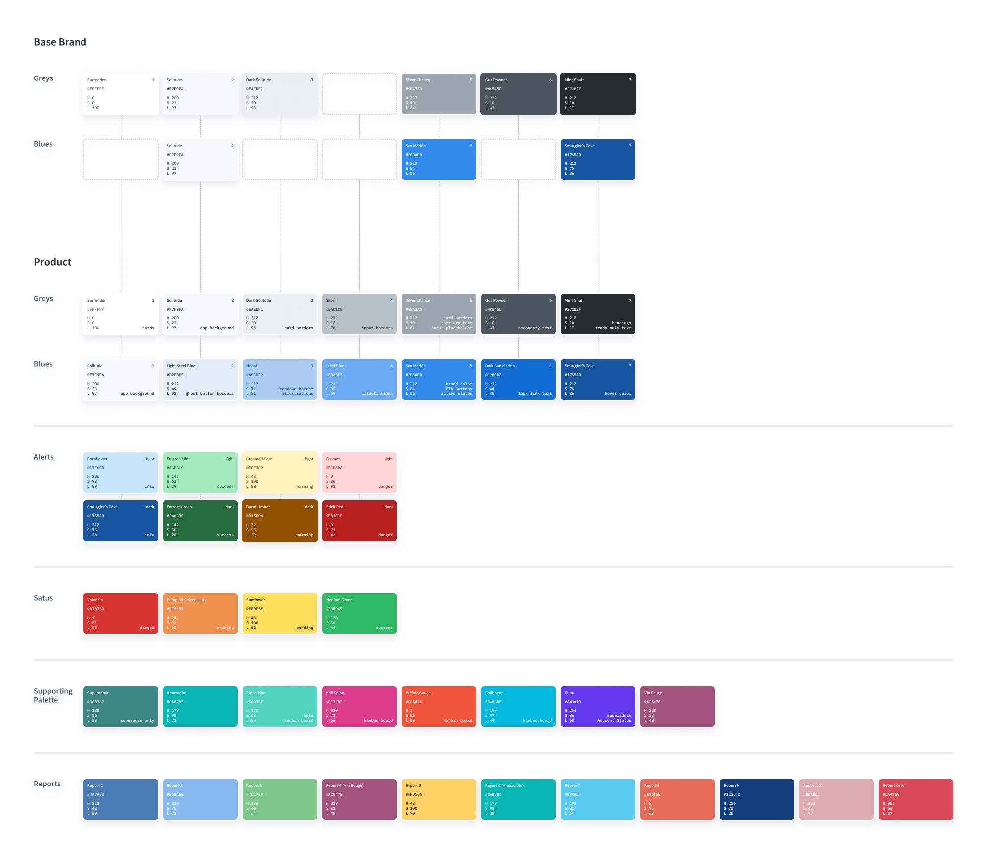
Speaking of color, a part of this process involved building and documenting a definitive color palette. Fortunately, the engineering team already had a list of common colors and names they had created for them. The resulting color palette needed to be consolidated somewhat, as some colors were nearly identical. The new palette was created as shared styles in Sketch and documented as part of the component library.
The file
As an artifact, the library was essentially one comprehensive Sketch file with all the reusable components (symbols), color styles, and typography styles built in. Broken up into pages, each component set had its own dedicated space, including color and typography.
At the time, library files didn’t yet exist, nor did we have the ability to publish changes and push them to other files. So each time we wanted to use components or styles, we essentially had to either copy/paste them into an existing file or duplicate the entire file to use a as base for new projects, which is mostly what we did moving forward. We called it the “UI Kit” and synced it to our shared Dropbox folder where our UX designer, UX director, and 2 product owners could reference the latest copy at any time. For the time being, that became the new workflow.
Here are some examples of what went into the file, including in-file documentation:
Implementation & testing
As we began using this new UI kit, we were able to quickly get a sense of how invaluable it was to our process. Having a set of building blocks for the UI helped making design decisions much faster. But as with any new tool, it needed to be improved. But as I worked on active projects, I became a user of my own tool, allowing me first-hand experience to understand where it could be improved. Ever project I worked on where UI/UX decisions were needed for the app, I was using the kit to build high-fidelity pattern-accurate mockups to ensure engineers had the best handoff guidance from the UX team. Through this process, each pain point I felt using the kit was an opportunity to improve it. When I came across a missing pattern, I would add it. When I came across an inconsistency, I would address it ad decide what the ‘correct’ should be, considering what was in production already and what the desired styling was. When I came across bugs with our components, I would fix them.
After the UX team had been using the new kit for a while and I had a good handle on what patterns we had, where they were used, how they were designed, and what they were intended for, I was ready to take on the next phase, building a style guide.
Component library
The process
With a detailed list of all the UI patterns in the app, I could start building reusable components as symbols in Sketch, our UX design tool at the time. I essentially went through the audit one pattern at a time, visited a few locations where it existed in the app, and used the those coded instances to build out a standardized and reusable version in Sketch. I referenced the CSS through my browser’s inspect panel to ensure I had the most accurate colors for backgrounds, borders, and text, as well as pixel values for font sizes, border radii, heights, widths, and spacing. Every detail I could pull, I did.
As I built each new component, one common challenge was finding inconsistencies between instances of our coded UI patterns. So I had to take some creative license to make decisions on what the new standards would be moving forward. For example, we had slight variations in the border color and radius of form input fields. So I picked a color and kept pressing on.
Speaking of color, a part of this process involved building and documenting a definitive color palette. Fortunately, the engineering team already had a list of common colors and names they had created for them. The resulting color palette needed to be consolidated somewhat, as some colors were nearly identical. The new palette was created as shared styles in Sketch and documented as part of the component library.
The file
As an artifact, the library was essentially one comprehensive Sketch file with all the reusable components (symbols), color styles, and typography styles built in. Broken up into pages, each component set had its own dedicated space, including color and typography.
At the time, library files didn’t yet exist, nor did we have the ability to publish changes and push them to other files. So each time we wanted to use components or styles, we essentially had to either copy/paste them into an existing file or duplicate the entire file to use a as base for new projects, which is mostly what we did moving forward. We called it the “UI Kit” and synced it to our shared Dropbox folder where our UX designer, UX director, and 2 product owners could reference the latest copy at any time. For the time being, that became the new workflow.
Here are some examples of what went into the file, including in-file documentation:
Implementation & testing
As we began using this new UI kit, we were able to quickly get a sense of how invaluable it was to our process. Having a set of building blocks for the UI helped making design decisions much faster. But as with any new tool, it needed to be improved. But as I worked on active projects, I became a user of my own tool, allowing me first-hand experience to understand where it could be improved. Ever project I worked on where UI/UX decisions were needed for the app, I was using the kit to build high-fidelity pattern-accurate mockups to ensure engineers had the best handoff guidance from the UX team. Through this process, each pain point I felt using the kit was an opportunity to improve it. When I came across a missing pattern, I would add it. When I came across an inconsistency, I would address it ad decide what the ‘correct’ should be, considering what was in production already and what the desired styling was. When I came across bugs with our components, I would fix them.
After the UX team had been using the new kit for a while and I had a good handle on what patterns we had, where they were used, how they were designed, and what they were intended for, I was ready to take on the next phase, building a style guide.
Style guide
With our first UI kit / pattern library created and in use, we had the initial foundations of what we would eventually come to call our design system. But in order to ensure our new standards were consistently implemented, they needed to be understood and easily referenced by both UX and engineering teams. In other words, it was time to create documentation.
I began drafting this new style guide in Sketch as part of the UI kit so that our component library would always be accompanied by associated documentation. However, the long-term goal was to build it as web page managed by the engineering team so they could bake in real styles and component examples. So I designed the style guide to look like web pages and used our own app styling to get a design together more quickly and reinforce our own UI standards in the process.
As for the IA, I matched what I had previously created for the UI kit. Each page in the kit became a page in the style guide. This would ensure parity and easier navigation across both.
Viewing the style guide
Because it was designed to eventually become an interactive website, I saw an opportunity to turn the static pages within Sketch into an interactive prototype. At the time, Sketch didn’t have a prototyping function. But we did heavily use InVision. So through their Craft plugin, I wired up the style guide to become an interactive prototype, complete with a navigation with links to all pages. This helped the team get by without a real coded documentation site in the mean time while also giving me an opportunity to get a better feel for the UX of the documentation itself. There weren’t really any major changes, though. Mostly just frequent updates to the content to further refine guidance and update examples as we made pattern changes or introduced new ones.
Online documentation
Before long, the engineering team built a real version of the style guide and later adopted the “UI Kit” name that we had been using for our reusable Sketch file. At this point, we had a thorough kit used by the design team and online documentation that we could all use to stay informed and in sync. This was also another huge step forward towards the formation of a comprehensive design system for our product.
Tooling milestones
With a solid foundation of reusable components, styles, and easily accessible documentation, improvements from here on out were often refinements and enhancements around our design tooling. The following are notable milestones.
Shared library
As I mentioned before, our initial build of the component library in Sketch was really just a single file, synced via Dropbox. When Sketch released their cloud library feature, this enabled us to store the file in a new location and have a more direct way of pulling a new copy of it as we started new projects or needed to reference something. It wasn’t a significant change, but still helped.
Migration to Figma
Easily the single most impactful change to our workflow and tooling, we migrated from Sketch to Figma in 2019. During this switch, two major changes to our UI workflow took place:
I separated out our components and styles across separate library files rather than all in one as before. As our design system grew over time, it made sense to divide things up to make it easier to digest and navigate.
The way Figma allows publishing libraries and styles to be updated across other files was a game-changer. It helped us keep our growing number of design project files in sync with the latest versions of our components and styles.
Additionally, the ability for multiple people to edit a file at the same time unlocked new opportunities for collaboration and time savings.
AutoLayout
One of my favorite Figma features I adopted as soon as it was available was AutoLayout. This feature unlocked flexibility in layout across the vast majority of our UI components. Though the initial version had a somewhat steep learning curve and still left a lot to be desired, it was still an incredibly valuable enhancement that saved the team time by reducing the need to constantly readjust sizes and position of UI components.
Variants
Having an even deeper impact than AutoLayout, the addition of Variants allowed us to drastically simplify our UI component structure by consolidating different versions of components such as states like default vs hover vs disabled, sizes, whether an icon was included, among many others specific to our patterns.
Implementing Variants was likely also the most time-intensive update I’ve ever made to our component libraries. But it was well worth it. It just needed to be phased out over a longer period of time to get to everything. However, starting with the most important and frequently used patterns like cards and buttons helped make the biggest and most helpful impact as early as possible.
Component Properties
Similar to Variants, the later release of Component Properties further simplified variations of our UI components while again improving the usability of components themselves. Combined, these 2 features allowed me make the biggest and most helpful impacts to our component libraries by improving usability and speed when our UX team implements these UI building blocks into their design files.
Variables
The latest innovative upgrade to our component library is less visible to our UX team than the previous aforementioned enhancements, but helps in a new way: parity with engineering. A bigger and more challenging problem to tackle is ensuring that design details neatly tucked away behind the scenes in our design files is in sync with the code tucked away behind the scenes in our codebase. But this has been an exciting challenge to tackle.
Though we do have some basic design tokens for things like color names, we’ve so far missed out on the deep impact design tokens can have in building and scaling design system…until now. With the release of Variables, there’s been new energy among the team to push into this space. And as a timely coincidence, our design systems guild had recently decided to more firmly establish the idea of a base pixel value for sizes, including spacing, border radius, and more. So this was a perfect opportunity to begin exploring how those standardized sizes could be applied as Variables within Figma ahead of doing the associated engineering work.
After quite a bit of exploration and some collaboration with engineering, I settled on a design token structure for number-based variables. These apply mostly to spacing, border radius, font sizes. We now have tokenized numbers applied as Variables to all our component libraries in Figma. Next up: colors.
Future work
A design system is never complete. However, with where our business stands today, the work I’ve done over the years to create standardized and reusable UI patterns has set up our UX team very well through helping them work faster, reduce friction in the design process, and have an easier time translating design work over to engineering requirements.
While there is always room for improvement, there’s little ongoing work necessary for our UI libraries in order to continue supporting our UX and engineering teams. And that frees me up to work on other things such as innovating on the UI or supporting the team in new ways that help us grow and go further, together.
I am extremely satisfied with the impact I’ve been able to make across over 7 years of building CallRail’s UI libraries and ultimately, a design system.
Thanks for reading! If you’d like to hear more about my process or how I think about design systems work, head over to my profile on Medium and let me know if you find it helpful.
一